Challenge
Spark Business Works acquired Elevator Up in spring 2019. At the time of the acquisition, Spark was heavily immersed in the construction industry, with that being their primary client-base, focusing on web design and development largely. EU, on the other hand, had a more diverse client base with a more substantial focus on design thinking practices. The two had similar, but different service offerings.
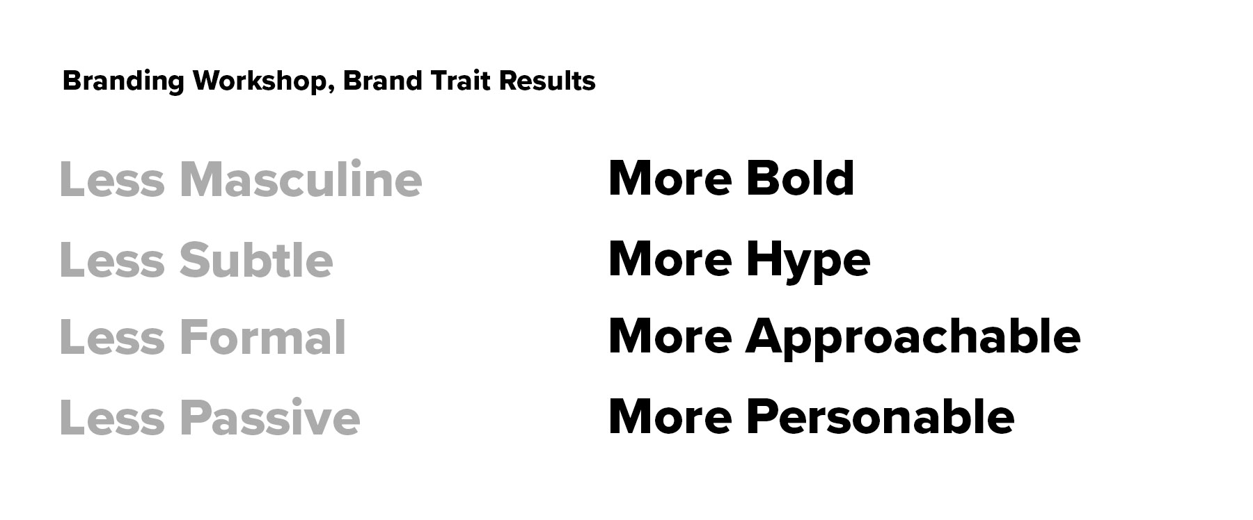
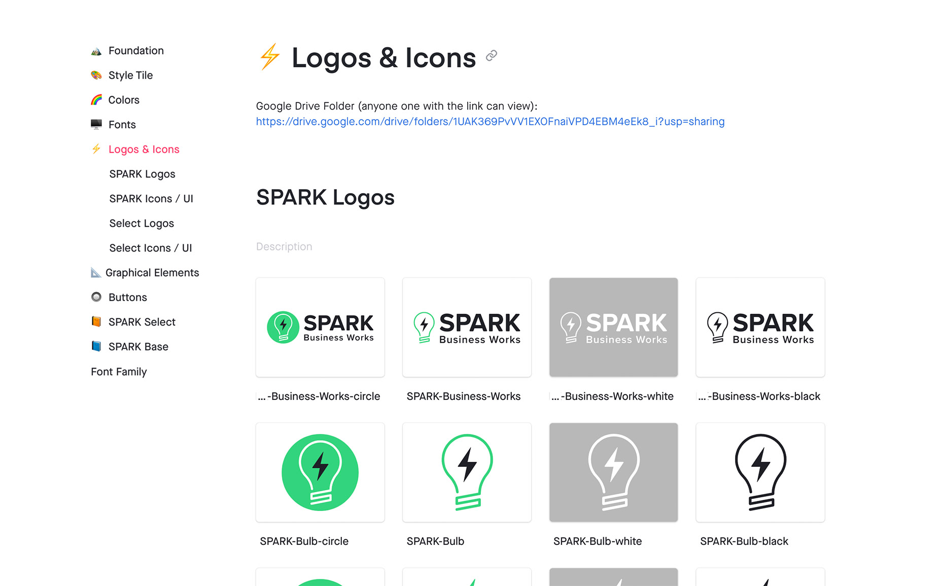
Pre-acquisition, Spark’s branding was very masculine, passive, and mostly black and white. But for their primarly male client base, the brand fit. Post-acquisition, new design knowledge was attained, service offerings expanded, clients were more diverse, and the overall team grew. With all of these major changes, Spark’s old branding no longer fit the company’s culture, which put them in the perfect position to kick off new branding efforts.
Solution
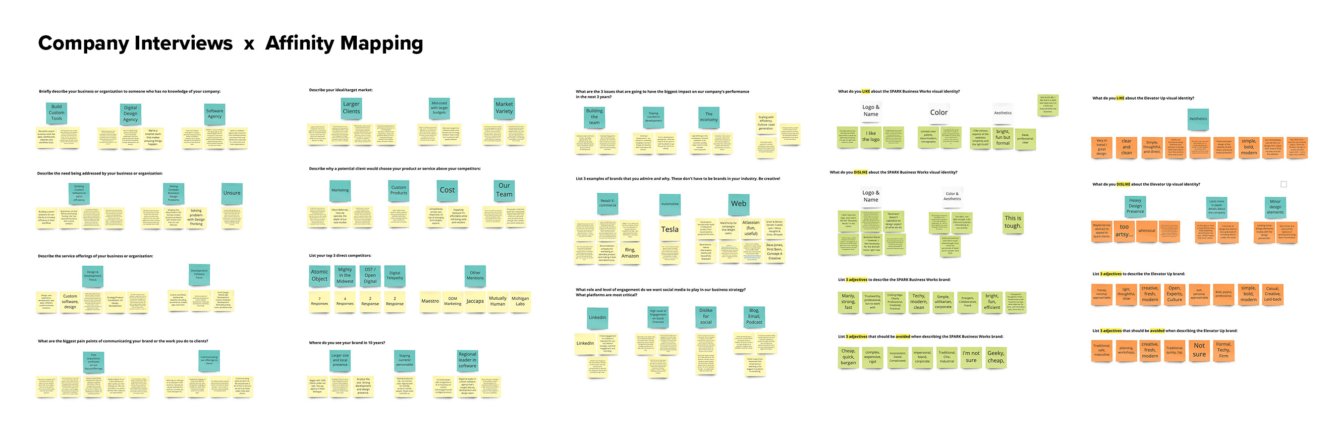
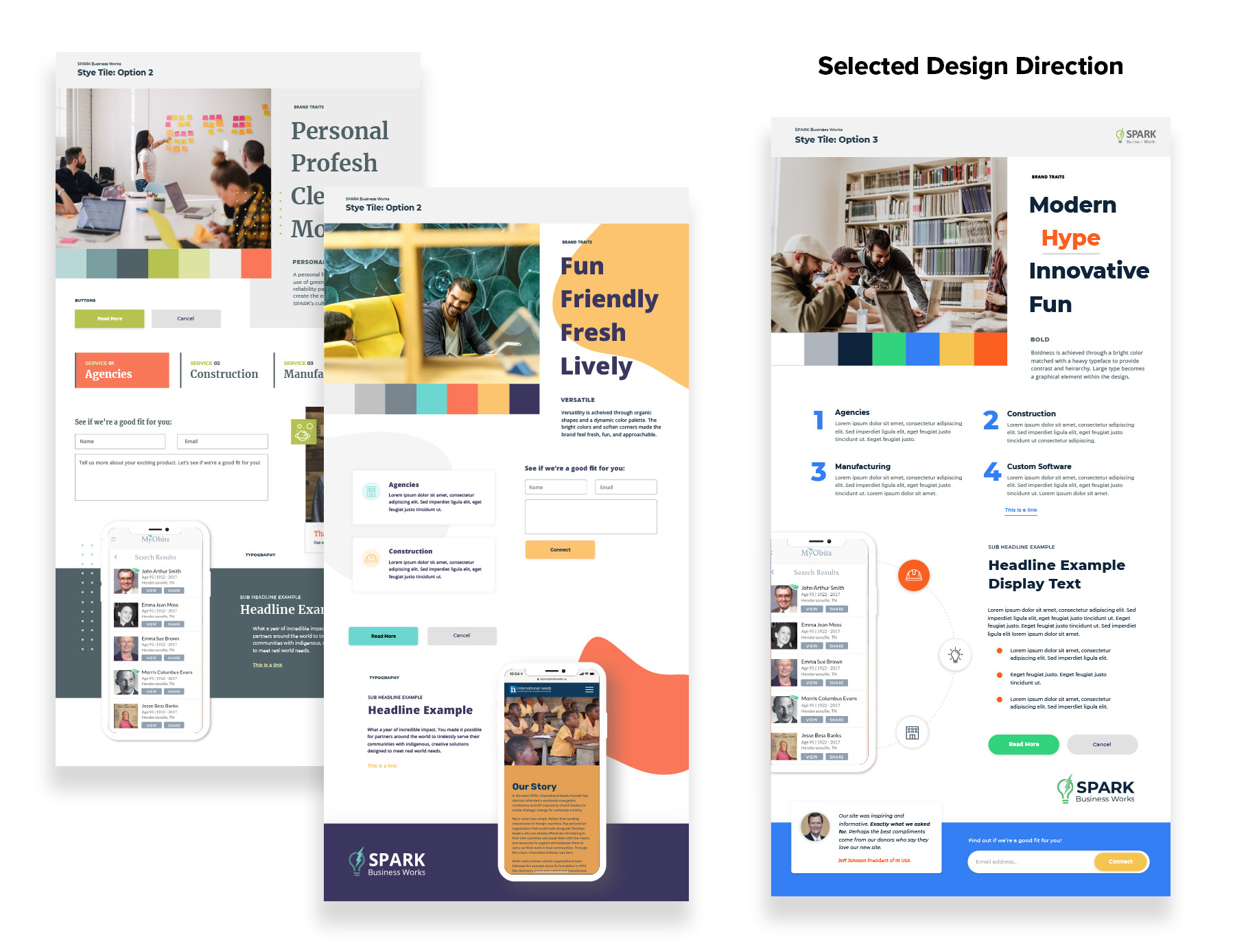
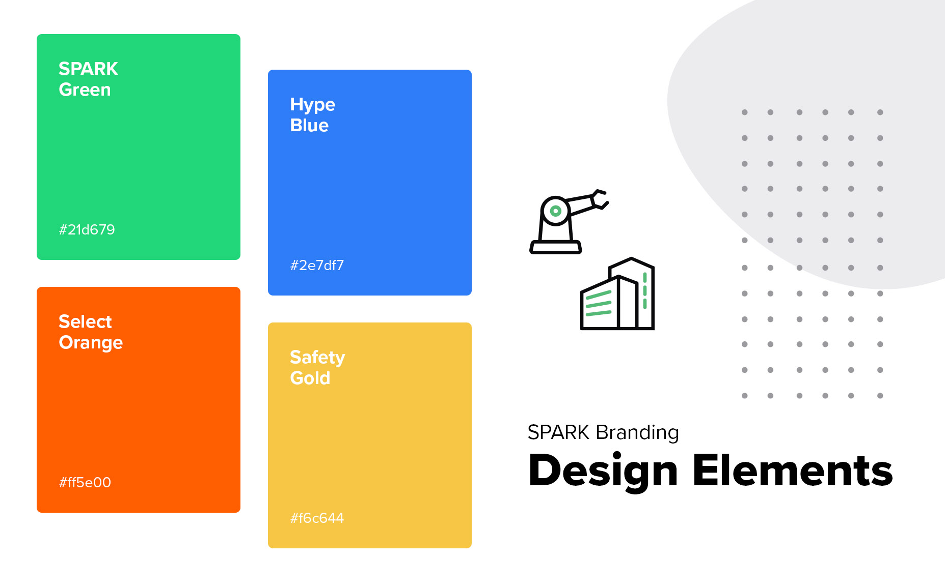
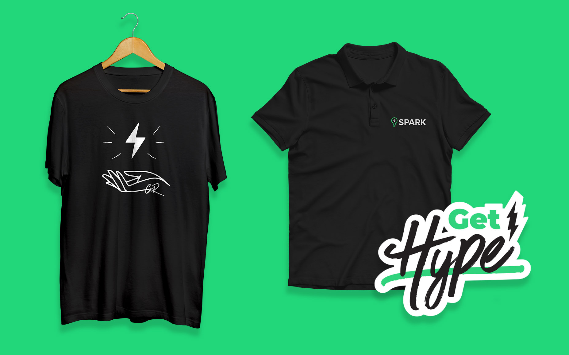
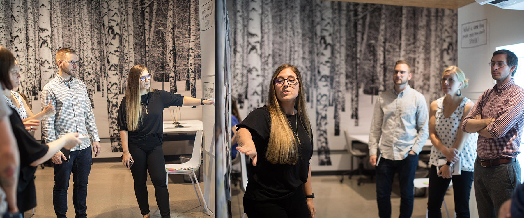
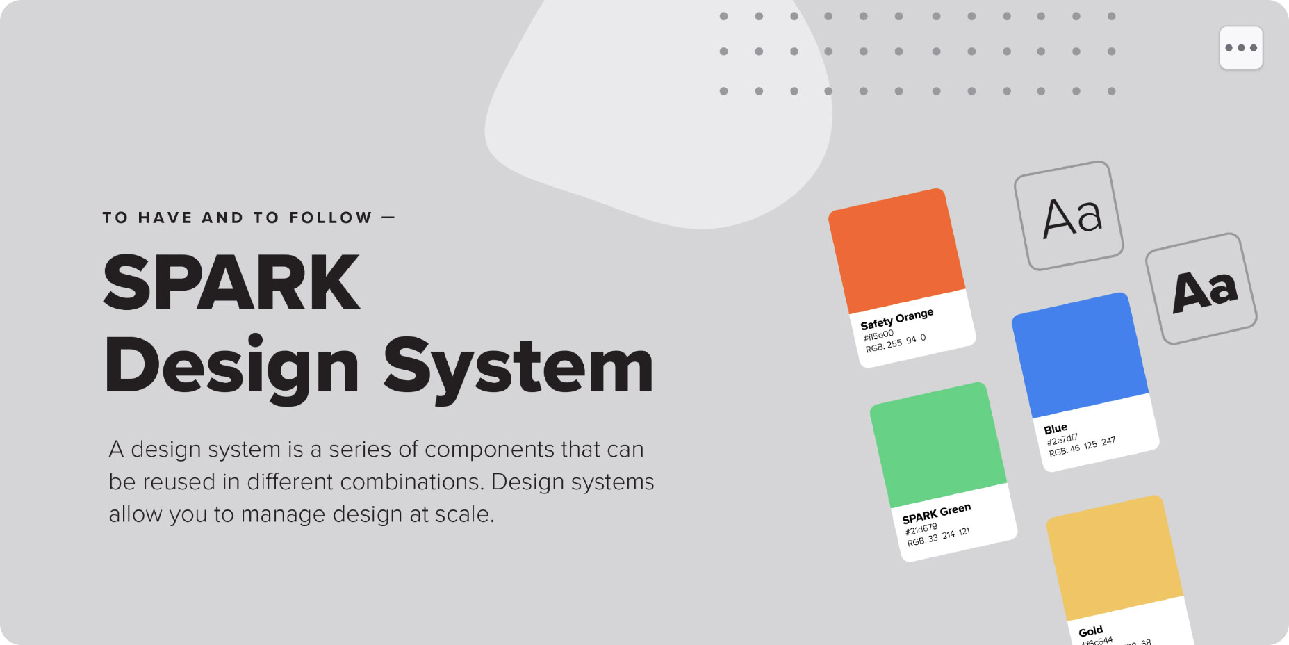
After walking the leadership team through a Design Workshop, we gained insight on their visions for the future and Spark’s new tone and manner. We took those desired and undesired traits to translate into style tiles to help communicate the visual essence of a brand direction. After working through the options, we found a visual direction that better fit our company culture which is bold, hype, innovative, and fun!